
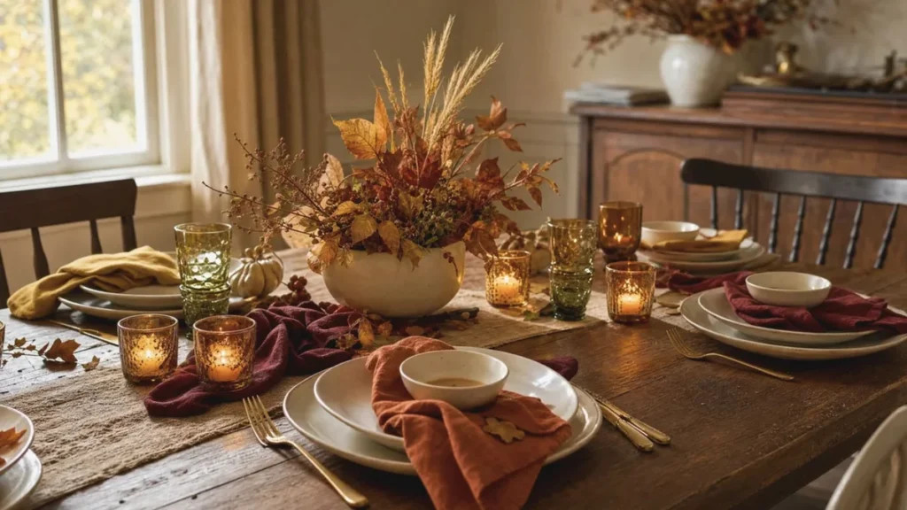
Every year around late November, I go through the same ritual: pull the good plates out of the top shelf, check the bulb boxes in the hallway closet, and stare at my own table setting until it stops looking like a craft store display.
Thanksgiving colors are broadly orange, red, yellow, and brown, pulled straight from fall foliage and harvest food. Gold, deep green, and cream round out the set in most homes. That’s the short answer. The useful answer — the shades that actually work on a real table by Wednesday night — is what this post is about.
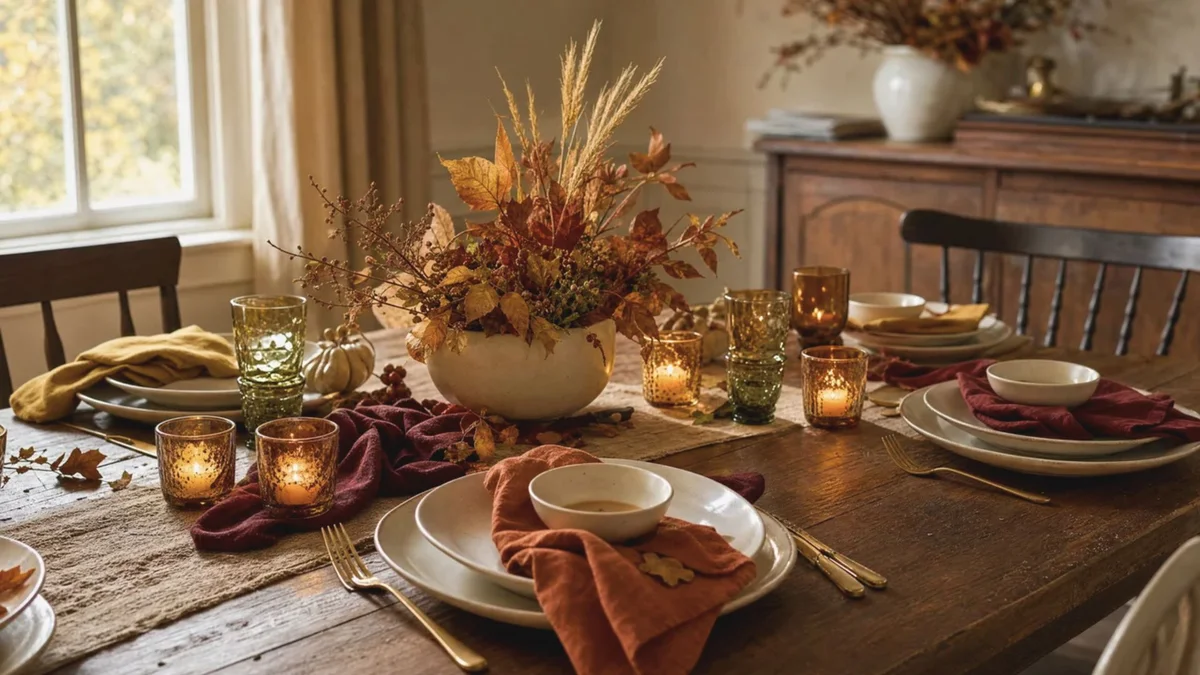
I’ve styled enough holiday tables to know which orange goes muddy under the wrong light and which one glows. As an editor, I’d rather hand you the eight palettes I keep saved and let you stop guessing.
What Are Thanksgiving Colors?
The core group has stayed steady for over a century. There’s no official palette — no governing body or registry ever set one, which surprises most people. The “5 colors of Thanksgiving” you hear about are just the first four below plus green. Cultural associations that stuck.
| Color | What it signals | Where it works |
|---|---|---|
| Orange | Harvest, abundance | Centerpieces, pumpkins, candles |
| Red | Warmth, gathering | Napkins, berries, glassware |
| Yellow | Light, plenty | Dried stems, place cards, florals |
| Brown | Comfort, steadiness | Wood, chargers, woven textures |
| Gold | Gratitude | Flatware, rims, small metal accents |
| Deep green | Renewal | Garland, herbs, foliage runners |
Why These Shades Became Thanksgiving Colors
They were already in the room. Falling leaves outside the window, harvest food on the plate. Each color traces back to something physically present at a late November meal.
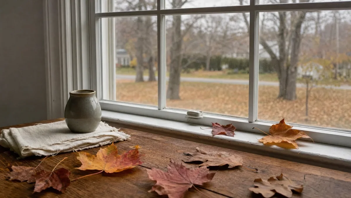
Thanksgiving lands in late November, when maples and oaks are shedding. Color expert Leatrice Eiseman, who has written several books on color psychology, points to fallen leaves as a direct source of the orange-and-red association. You see the palette every time you drive anywhere in New England or the Midwest that week.
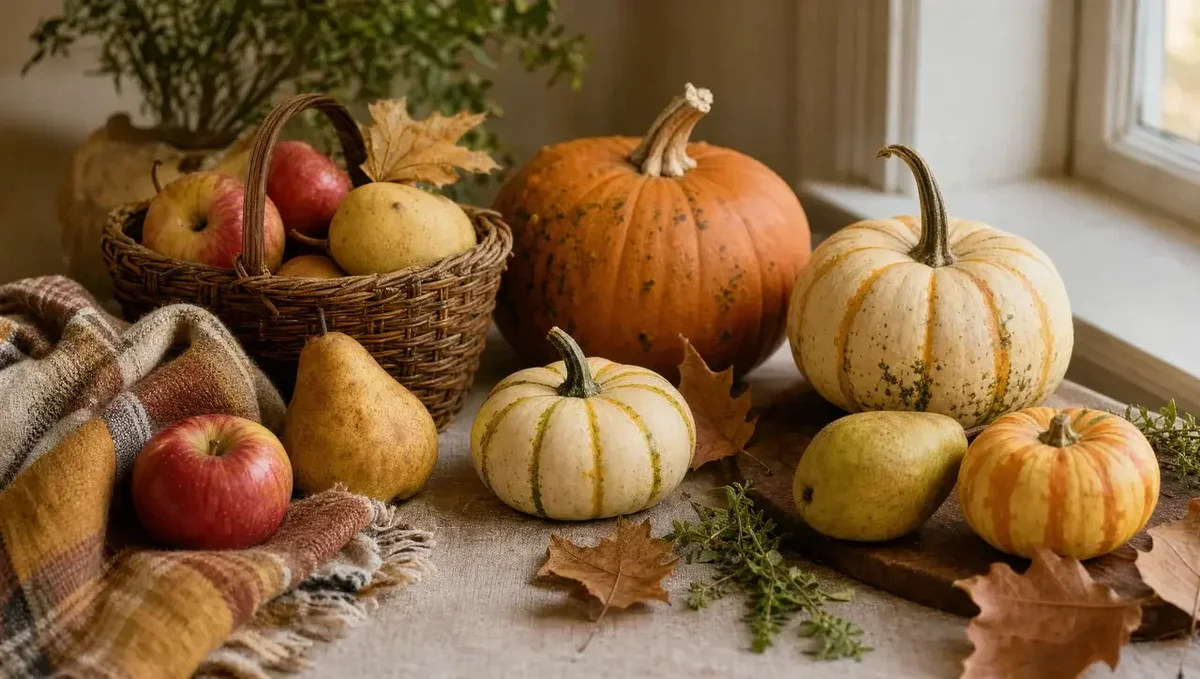
Eiseman also makes a point about appetite: orange and red stimulate hunger, which is why they dominate food branding. A holiday built around one enormous meal borrows its palette from the meal itself. Pumpkin and squash carry the orange, cranberries and apples the red, corn and wheat the yellow, roast turkey the brown. Four of the six colors are sitting on the plate.
The history almost nobody mentions
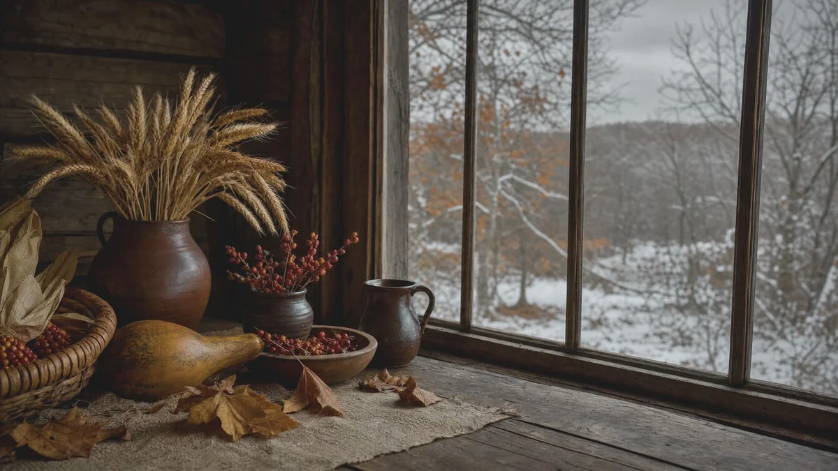
Melanie Kirkpatrick, author of Thanksgiving: The Holiday at the Heart of the American Experience, has noted that the Pilgrims lived through the Little Ice Age — New England winters ran harsher, and snow often arrived before the holiday. The autumn palette we treat as historical is largely a later invention, spread west by New Englanders as they migrated. So you have far more permission to break from tradition than you think.
8 Thanksgiving Color Palettes With Hex Codes
I keep these saved for card design and mood boards. Paste any hex straight into Canva or a paint app.
Traditional palettes
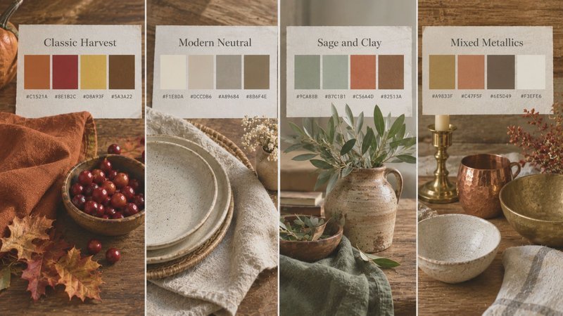
| Palette | Colors | Hex codes |
|---|---|---|
| Classic Harvest | Burnt orange, cranberry, wheat gold, walnut brown | #C1521A, #8E1B2C, #D8A93F, #5A3A22 |
| Modern Neutral | Cream, oat, warm taupe, wood brown | #F1E8DA, #DCCDB6, #A89684, #8B6F4E |
| Sage and Clay | Sage, terracotta, bone, olive | #9CA88B, #B65D3C, #EDE4D6, #6F6B3A |
| Mixed Metallics | Brass, copper, bronze, cream base | #A9833F, #B06A3B, #7A5A34, #EFE6D6 |
Modern Neutral is my most-used set for small dining rooms. Warm whites and oat tones keep a tight space open while still reading seasonal.
Modern palettes
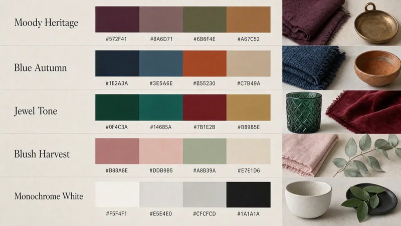
| Palette | Colors | Hex codes |
|---|---|---|
| Moody Heritage | Deep plum, charcoal, oxblood, antique brass | #4A2340, #37393B, #6B1F26, #9C7A3C |
| Blue Autumn | Navy, rust, ivory, aged copper | #1F2A44, #A8501F, #F3EDE2, #A96A38 |
| Jewel Tone | Emerald, sapphire, garnet, antique gold | #1F5C4A, #24406E, #7A1B2E, #C79A3A |
| Blush Harvest | Dusty rose, champagne, silver grey, pale sage | #C99A93, #E7D6B8, #B4B2AE, #C2CBB4 |
Blue Autumn is the sleeper pick. Navy against rust reads richer than orange against brown — and most of you already own navy plates or a navy runner.
Monochrome White: #F7F4EE, #EAE3D7, #22201E, #6E7A5A. Neutral white with dark accents. It’s the one palette in this set I keep reaching for when I want the table to feel quiet — and it’s the one the source article counted as its ninth palette without ever giving it a name, so I’m naming it. If your room already runs warm and busy, this is the reset.
How to Use Thanksgiving Colors Without Crowding a Room
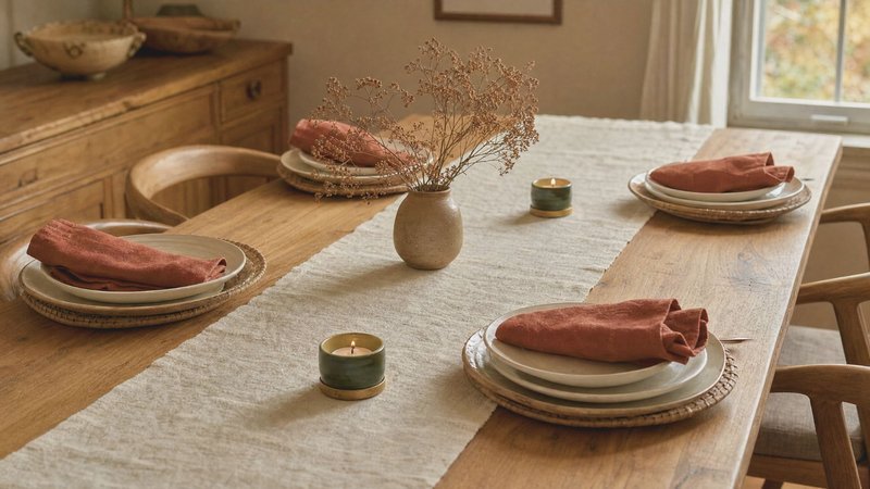
Picking shades is the easy half. Deciding how much of each to use is where tables go wrong — and it happens to nearly everyone the first time.
The 60-30-10 split
Give one color 60% of the visual weight, a second 30%, a third 10%. On a table, that translates cleanly:
- The 60% layer: tablecloth, runner, or bare wood surface — the largest uninterrupted area.
- The 30% layer: plates, napkins, chargers. Repeated objects add up fast.
- The 10% layer: candles, place cards, florals, a single stem of berries.
Stick to that and the table looks styled. Give four colors equal weight and it looks like a craft store shelf.
My own mistake, repeated for years
For three or four seasons I treated every accent as equally important. Orange pumpkins, red napkins, gold flatware, green garland — all competing. Every photo came out busy. The fix: drop to one accent color and repeat it three times down the length of the table. Same objects, less noise. If you own a lot of seasonal pieces, box half of them before you set anything down.
The cheapest way to shift a palette
Change the 60% layer only. A single runner in sage or navy changes the read of an entire table while your existing white plates and brass candlesticks stay put. It’s a twenty-dollar change instead of a full replacement.
Thanksgiving Colors Beyond the Dining Table
Guests spend more time standing in your entryway and living room than sitting at the table. Almost every article on this topic skips both spaces.
Entryway and porch
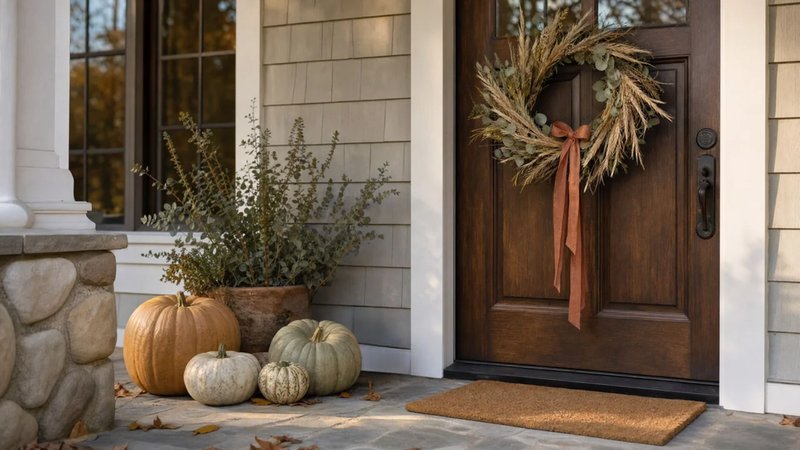
The front door sets expectations before anyone walks in, so keep it to two moves. Hang a wreath in your accent color — dried wheat, eucalyptus, or a rust ribbon on a plain base. Then group pumpkins in odd numbers, three or five, at varied heights. Even groupings read as staged. Skip the doormat swap unless yours is worn; it’s the lowest-impact purchase in seasonal decorating.
Mantel and living room
The mantel carries your palette upward so the room feels connected rather than color-blocked at table height. Set candles at staggered heights in cream or amber, grouped at one end instead of centered. In the living room, throw pillows and a blanket are the fastest seasonal swap in any house — two pillows in your 30% color do the whole job. Nearly everything here carries over from Halloween and forward into December if you skip novelty prints.
Lighting Changes How Thanksgiving Colors Read
This is the piece I wish someone had told me in year one. You can pick a flawless palette and lose it entirely to the wrong bulb. I tested one tablescape under two bulbs last November. Under 2700K, the burnt orange linens read rich and deep. Under 4000K, the same linens went flat and slightly grey — closer to brown than orange. Warm palettes need warm light. Check the box before you buy replacement bulbs, and aim for 2700K in any room where you’ll eat. Thanksgiving dinner runs from late afternoon into dark, so your lighting changes mid-meal. A dimmer on the dining fixture solves that for under fifty dollars. And unscented candles only on the table — scented ones compete with the food, which defeats the point of the day.
What Colors to Wear to Thanksgiving Dinner?
Rust, mustard, olive, burgundy, and cream photograph well and sit comfortably inside the seasonal palette without matching it exactly. One practical note from years of holiday shoots: if you’re hosting, don’t wear the same color as your tablecloth. You disappear in every photo taken from across the table. Texture carries more weight than color here anyway — knit, corduroy, and suede read seasonal on their own.
Bottom Line
Orange, red, yellow, and brown sit at the core of Thanksgiving, with gold and green filling in around the edges. Everything past that is preference. Pick one palette from the tables above, start with the layer you already own, add the other two layers in the 60-30-10 ratio, check your bulbs, and stop there. The best holiday tables I’ve styled had fewer objects on them than the ones I overthought.
Frequently Asked Questions
What colors symbolize Thanksgiving?
Orange, red, yellow, brown, and gold are traditional Thanksgiving colors. They represent autumn leaves, harvest crops, warmth, abundance, and the changing season.
What are Thanksgiving outfit colors?
Popular options include rust, burgundy, mustard, olive green, brown, cream, and burnt orange — warm, earthy shades that reflect the fall season without matching your tablecloth exactly.
What are three symbols of Thanksgiving?
The turkey, cornucopia, and pumpkin. They’re traditionally associated with the holiday meal, harvest, and abundance.
A Note From the Editor
I spent years overthinking this holiday’s table — four accents, six textures, zero calm. The edit is always the same: fewer objects, one palette, warm light. Less shelf, more glow. — Amelie Rose